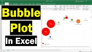
How To Create A Bubble Plot In Excel (With Labels!)
✉️ Join my newsletter https://steven-bradburn.beehiiv.com/subscribe In this tutorial, I will show you how to create a bubble plot in Microsoft Excel. A bubble plot is a type of scatter plot where two variables are plotted against each other, with a third variable being used to signify the size of the dots, known as bubbles in this case DARA SOURCES https://www.datawrapper.de/charts/scatter-plot https://www.gapminder.org/data/ VIDEO CHAPTERS 00:00 Intro 00:07 What is a bubble plot? 00:42 Example data 01:29 How to create a bubble plot 02:00 Adjusting the axes 03:22 Adjusting the bubble sizes 04:08 Adding data labels 05:17 Changing the bubble appearance 06:00 Changing the axes appearance 06:36 Wrapping up HOW I CREATED THIS TUTORIAL (AFFILIATE LINKS) Screen recorder & editor https://techsmith.z6rjha.net/c/1988496/506622/5161 Software (Microsoft Excel 365 ProPlus) FOLLOW US Website https://toptipbio.com/ Facebook https://www.facebook.com/TopTipBio/ Twitter https://twitter.com/TopTipBio AFFILIATE DISCLAIMER Some of the above links are affiliate links, meaning I will earn a commission if a sale is made after clicking on the link.
