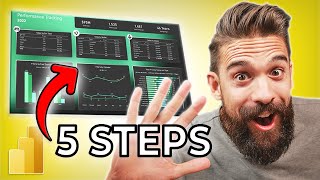
My First Power BI Dashboard: Sales Analysis Project | Beginner's Journey
Hey data enthusiasts! 👋
I'm excited to share my very first Power BI project - a sales analysis dashboard.
I created as a beginner.
This project was inspired by Rishabh Mishra's excellent tutorial, which guided me through the process. https://www.youtube.com/watch?v=6cV3OwFrOkk&t=15s
This hands-on experience helped me bridge customer service insights with technical data skills:
💡📊 Key Metrics (Cards):
-Total Sales (Sum of Amount): ₹438K
-Total Quantity Sold: 5,615 units
-Total Profit: ₹37K
-Average Order Value (AOV): ₹121K (calculated as Total Amount / Total Quantity)
📈 Visual Insights
1. Sales by State (Top 4) Maharashtra leads with the highest sales contribution. Followed by Madhya Pradesh, Uttar Pradesh, and Delhi.
2. Payment Mode Analysis (Donut Chart): COD (44%) dominates as the most preferred payment method. UPI (21%) and Credit Card (12%) follow Debit Card (13%)
3. Profit by Month (Stacked Column Chart): Peak Profit in January with a sharp decline afterward. Loss in May, indicating seasonal challenges or operational issues.
4. Top Customers by Spend (Stacked Bar Chart): Harivansh and Madhav are top customers, contributing significantly to revenue.
5. Sales by Product Category (Donut Chart): Clothing (63%) dominates in units sold, followed by Electronics (21%) and Furniture (17%).
6. Profit by Sub-Category (Stacked Bar Chart): Printers generate the highest profit, outperforming others like Bookcases, Saree, Tables, and Accessories.
🔍 Critical Observations:
1. Seasonality: Profits drop post-January, with May reporting a loss. This could reflect inventory mismanagement or reduced demand.
2. Payment Preferences: High reliance on COD (44%) suggests a customer base hesitant to prepay online.
3. Regional Focus: Maharashtra and Madhya Pradesh are key markets; consider targeted marketing here.
4. Sub-Category Opportunity: Printers are a high-margin product—expand inventory or promotions.
🔧 Technical Stack:
-Power Query for ETL(Extract, Transform, Load) pipeline setup.
-DAX(Data Analysis Expressions) for dynamic KPI calculations.
-Custom slicers for real-time filtering.
In just about an hour,
I learned how to:
Import and transform data using Power Query.
Create data models and relationships.
Develop DAX calculations and measures.
Design an interactive, user-friendly dashboard.
As a junior data analyst, this hands-on experience has been invaluable in applying the skills I'm learning in my Master's program.
It's one thing to list skills on a resume, but actually building a project brings those skills to life!
I'd love to hear your thoughts and suggestions for future projects.
What Power BI features should I explore next?
Don't forget to check out Rishabh Mishra's channel https://www.youtube.com/@UC3rY5HOgbBvGmq7RnDfwF7A for more great Power BI tutorials!
Project Learnings:
- Created an interactive dashboard to track and analyze online sales data
- Used complex parameters to drill down in worksheets and customization using filters and slicers
- Created connections, joined new tables, calculations to manipulate data, and enable user-driven parameters for visualizations
- Used different types of customized visualization (bar chart, pie chart, donut chart, clustered bar chart, scatter chart, line chart, area chart, map, slicers, etc)
#PowerBI #DataAnalysis #BeginnerProject #DataVisualization #LearningJourney #DataAnalytics #BusinessIntelligence #PowerBITutorial #DataScience #SalesAnalysis #DAX #PowerQuery #DataModeling #ContinuousLearning


