💪🏻 Create a Connected Dot/Dumbbell Chart in Excel
Video Not Working? Fix It Now
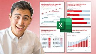
Create a Dumbbell/Connected Dot Plot Chart in Excel!
A dumbbell chart, also known as a DNA chart or connected dot plot, is a type of chart in Excel used to compare two or more data points along the same axis.
This chart is particularly useful for visualizing changes or differences between points, such as before and after values, different time periods, or comparative metrics.
In a dumbbell chart, each data point is represented by a series of dots connected by a line, resembling a dumbbell. This makes it easy to see the magnitude and direction of changes between the points.
In this lesson we are going to create from scratch a multi-point dumbbell chart based on data related to the Euro 2024 football tournament. ⚽️🏆🥅
Download Workbook ⬇️
https://www.cellmatestraining.com/download-dumbbell-chart
#msexcel
************************************************
🔗LINKS to related videos
🥩The SILENCE of the LAMBDA -- Create Your Own Excel Functions
https://youtu.be/hHwcrdjzQXU?si=UAuyWav_P8GZdqsa
💬TEXTBEFORE and TEXTAFTER -- New Excel Functions
https://youtu.be/LiYRzzoqNMU?si=Ae7kMm6-B1U14D0a
🪓SPLIT TEXT using Multiple Delimiters
https://youtu.be/JzJ6yHRuKcM?si=MwMfHzwcKVXnrKrk
************************************************
🤝Let's CONNECT on social:
➡️TikTok: https://www.tiktok.com/@cellmates_
➡️Instagram: https://www.instagram.com/cellmatestr...
➡️LinkedIn: https://www.linkedin.com/in/deborahas...
➡️Twitter: https://twitter.com/CellMates_
➡️Facebook: https://www.facebook.com/CellMates/
Comment